User education and onboarding
Designing user education and onboarding for a smooth transition to a new marketplace platform.
Overview
Vend (formerly Schibsted Marketplaces) owns several major classifieds marketplace brands in the Nordics, including DBA in Denmark, Finn in Norway, Blocket in Sweden, and Tori in Finland.
I joined Vend to help transition DBA to a new, modern platform. One of my primary responsibilities was user education and onboarding, ensuring users had the best possible experience when the new DBA platform launched.
After conducting user testing with a prototype I developed and performing a gap analysis of key user journeys, I proposed over 20 product changes related to user education and designed a new onboarding flow to introduce new key features.
Company
DBA (Vend)
My contribution
Product Design
User Research
User Testing
Released
February 2025
Context
DBA is a well-known online classifieds brand in Denmark with a long legacy and high user satisfaction among the Danish population. However, the product had been neglected for many years and no longer met user expectations for what a modern marketplace should offer, prompting the need to migrate to a new and rewritten platform.
I joined to help transition DBA from an old and outdated platform, to a new and modern platform, introducing many new features such as transactions and shipping that are expected from marketplace platforms today.
To provide the best possible experience for the +350.000 monthly active users of DBA, one of the primary projects I worked on during my time at DBA, was user onboarding and education. This project was about introducing the key new features and informing users about product changes, with the goal of giving users the best possible experience when they are migrated to the new platform.
Problem
When migrating to a new, modern platform - where many features are discontinued and new ones introduced - user onboarding and education play a vital role in ensuring that users transition smoothly to the new product and can still find what they're looking for. Without this, there’s a risk that users may churn or abandon the product.
My job was to design a smooth onboarding experience for users that are migrated from the old platform to the new modern platform.
 Elements of user education
 What is user education?
User education is about helping users understand and adapt to changes in a product - especially when new features or workflows are introduced. It's not just about explaining how things work, but guiding users through what’s new and why it matters.
For DBA, this was essential. We were launching a completely new platform with features like shipping, transactions, and user reviews - many of which didn’t exist before. Without proper education, users risked feeling lost or frustrated.
Our goal was to ease this transition by designing onboarding flows, tooltips, and contextual UI guidance to support users at key moments and ensure they felt confident using the new product.
User gap analysis
First, I needed to figure out what parts of the product would change and how users might react to the changes. So I started by conducting a gap analysis of the current DBA product, comparing it to the new platform which was already live in Finland called Tori - the platform that DBA would eventually become.
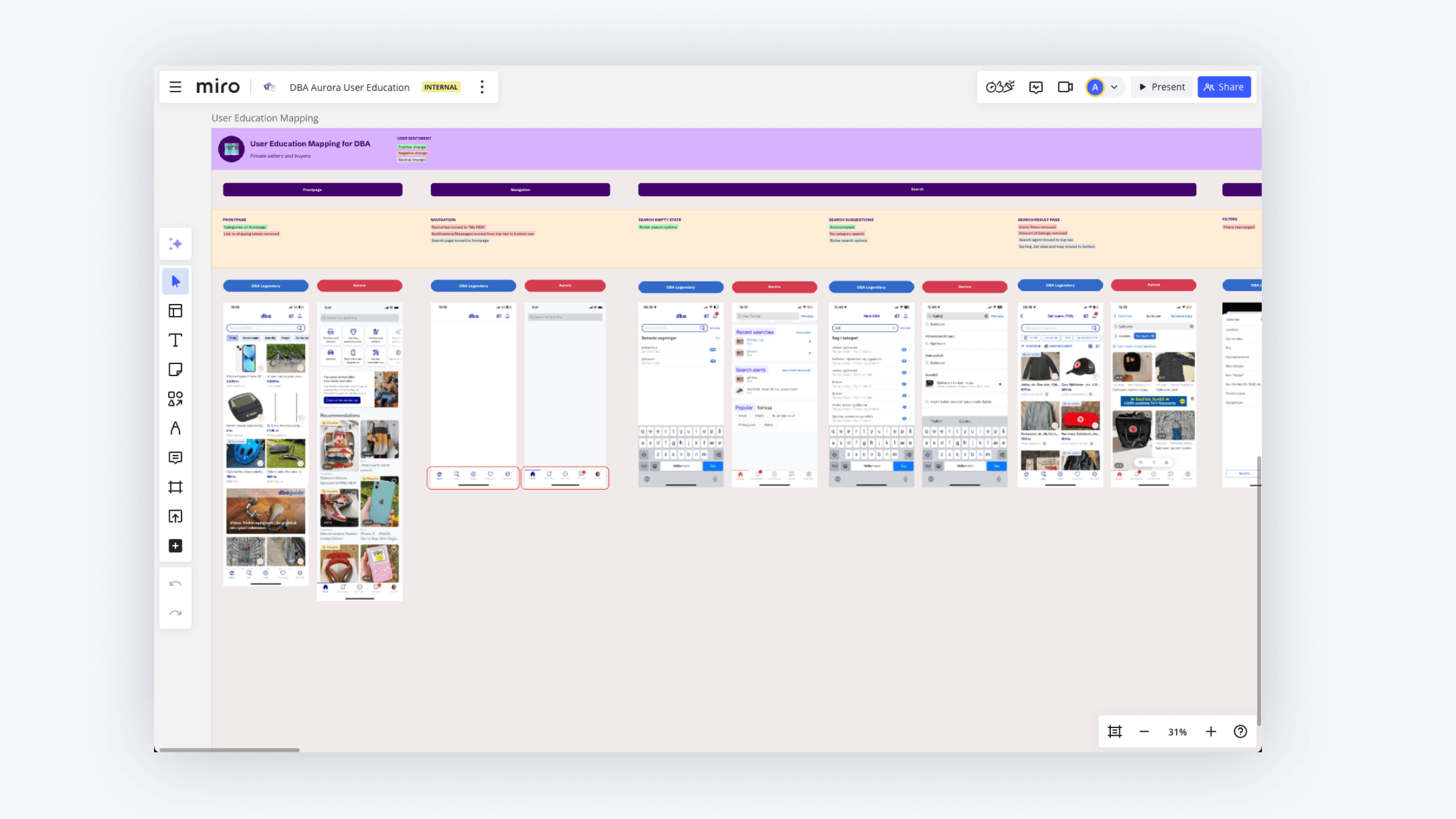 I created a gap analysis to highlight critical product changes
 I mapped out the key flows and flagged user sentiment for each screen, showing whether users would like react positively, negatively or neutrally to the the changes. This analysis served as the foundation for the project, showing where we needed to focus our efforts.
Prototype
While the gap analysis gave us a clear idea about where we needed to direct our efforts in terms of user education, it was also important to verify our assumptions and get the new app in the hands of users.
Working with a designer from the Finn office, we created a hi-fidelity prototype of the upcoming DBA app, using the shared design system called Warp, and adding in some early explorations for user onboarding and education to test the first impression, new information architecture, reactions to feature changes and general wayfinding.
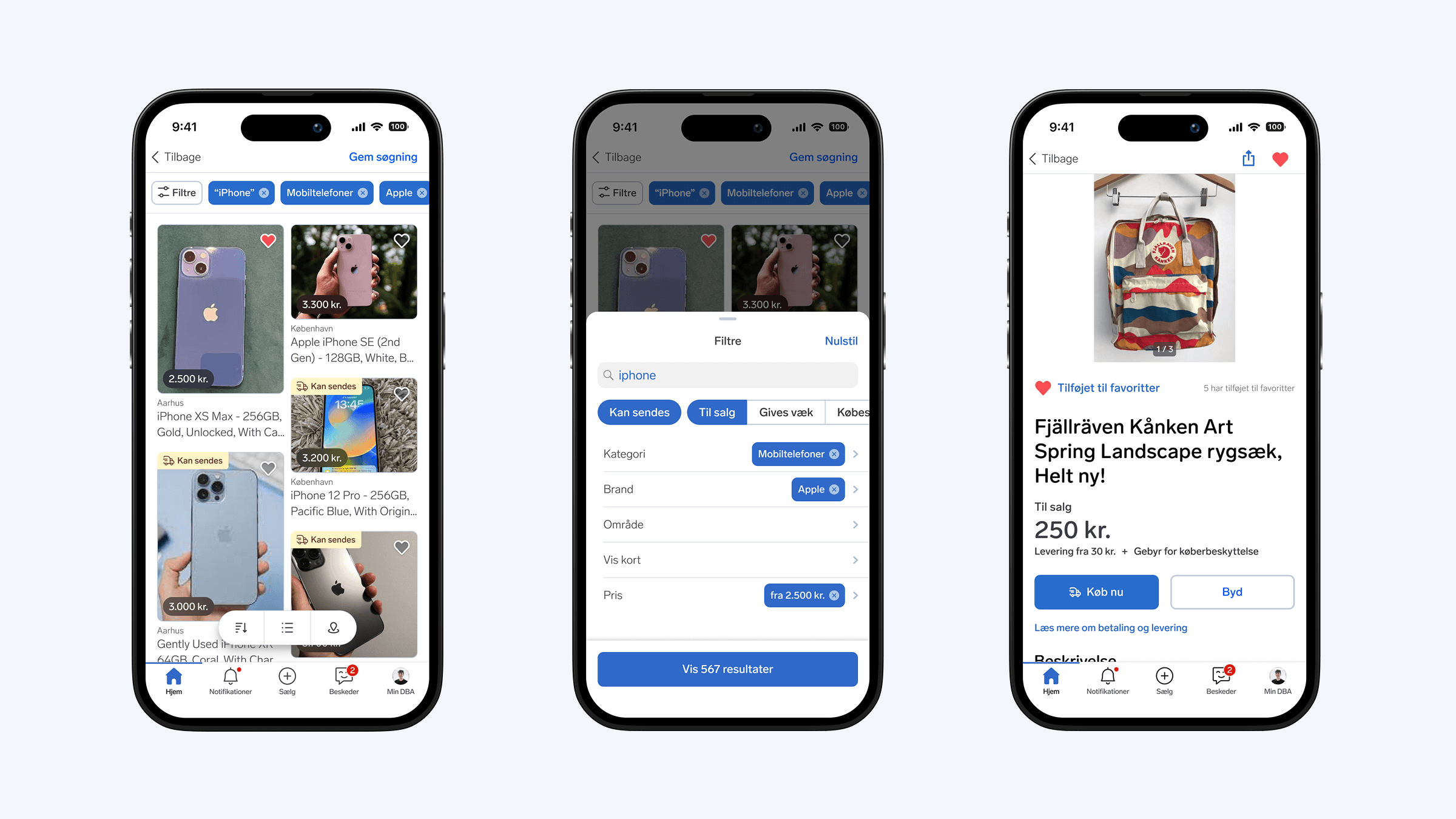 The high-fidelity prototype enabled test users to search, filter, sort, and browse products
 User testing the prototype
Writing the interview guide, I focused on testing many of the critical flows and user gaps I discovered when creating the gap analysis. Examples of these were related to onboarding, homepage first impressions, the search experience and notifications.
Together with my UX Manager, we went out to a local café to test the app prototype with five participants, each test taking about 30 minutes to complete.
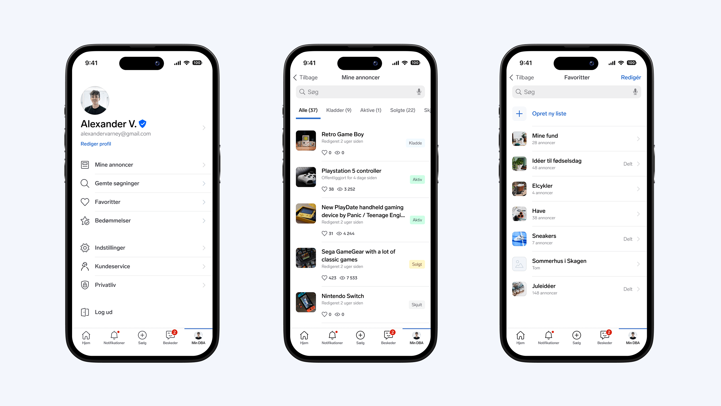 High-fidelity prototype with account settings, my ads, and favorites
 Insights from user testing
In the user tests of the prototype, we managed to validate many of our hypotheses and discovered some different UX issues to be addressed.
Overall experience
We asked participants to rate their impression of DBA on a scale from 1 to 10, both before and after testing the prototype. After testing, the overall impression improved by 1.1 points.
Navigation and wayfinding
Participants successfully navigated to the right sections based on our instructions. For example, they were able to view all of a seller's ads, find their own ads as a seller, search for items, and locate and use the filters.
New features
Participants were interested and positive about the new features DBA introduced, especially reviews, which is a highly requested feature similar to what they know from apps like Airbnb.
Interface and design
Participants appreciated the more modern interface, which follows familiar design conventions from other apps they know, making it easier to use and understand the app.
Sharing the learnings
Vend (owners of DBA) is a large organisation with over 50 product teams working on the new DBA product. So we made a presentation with our learnings from the user testing to be shared with the different teams working on the DBA product.
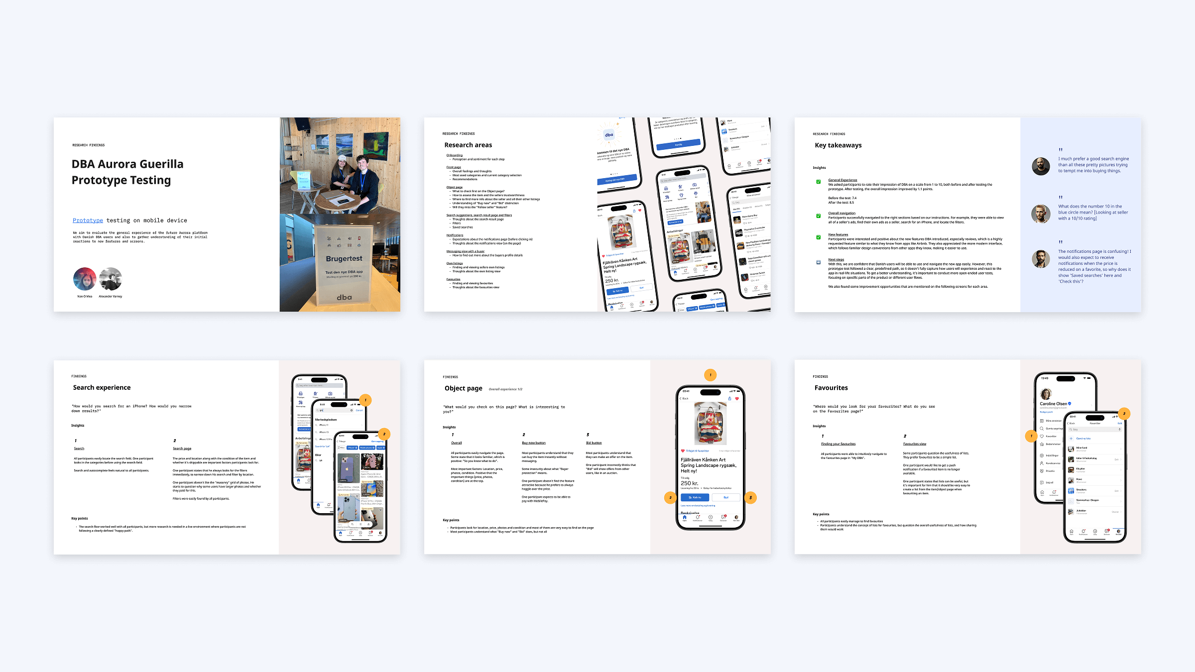 We shared our UX learnings and insights with different product teams and the rest of the organisation
 User education
With the key user gaps mapped in the user journey and with app prototype verified with users, it was time to design the different elements of user education to help users better understand and use the new DBA product.
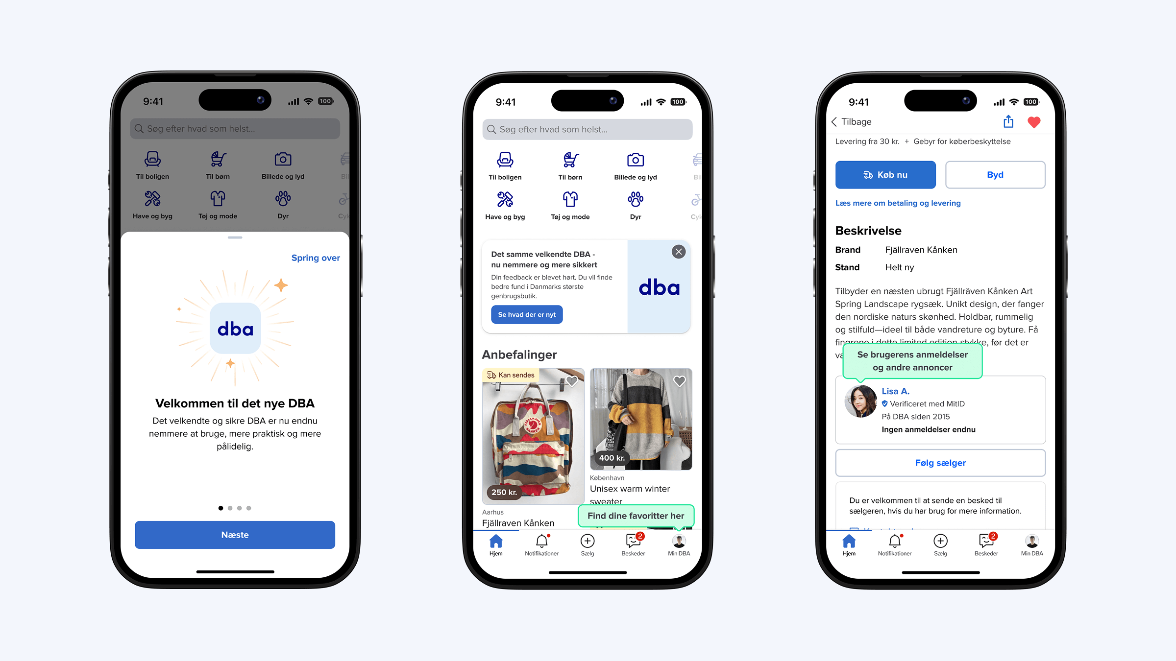
I designed a variety of UI elements depending on the context. In some cases, a simple popover or tooltip was sufficient, while in others, more detailed information was necessary to highlight feature changes.
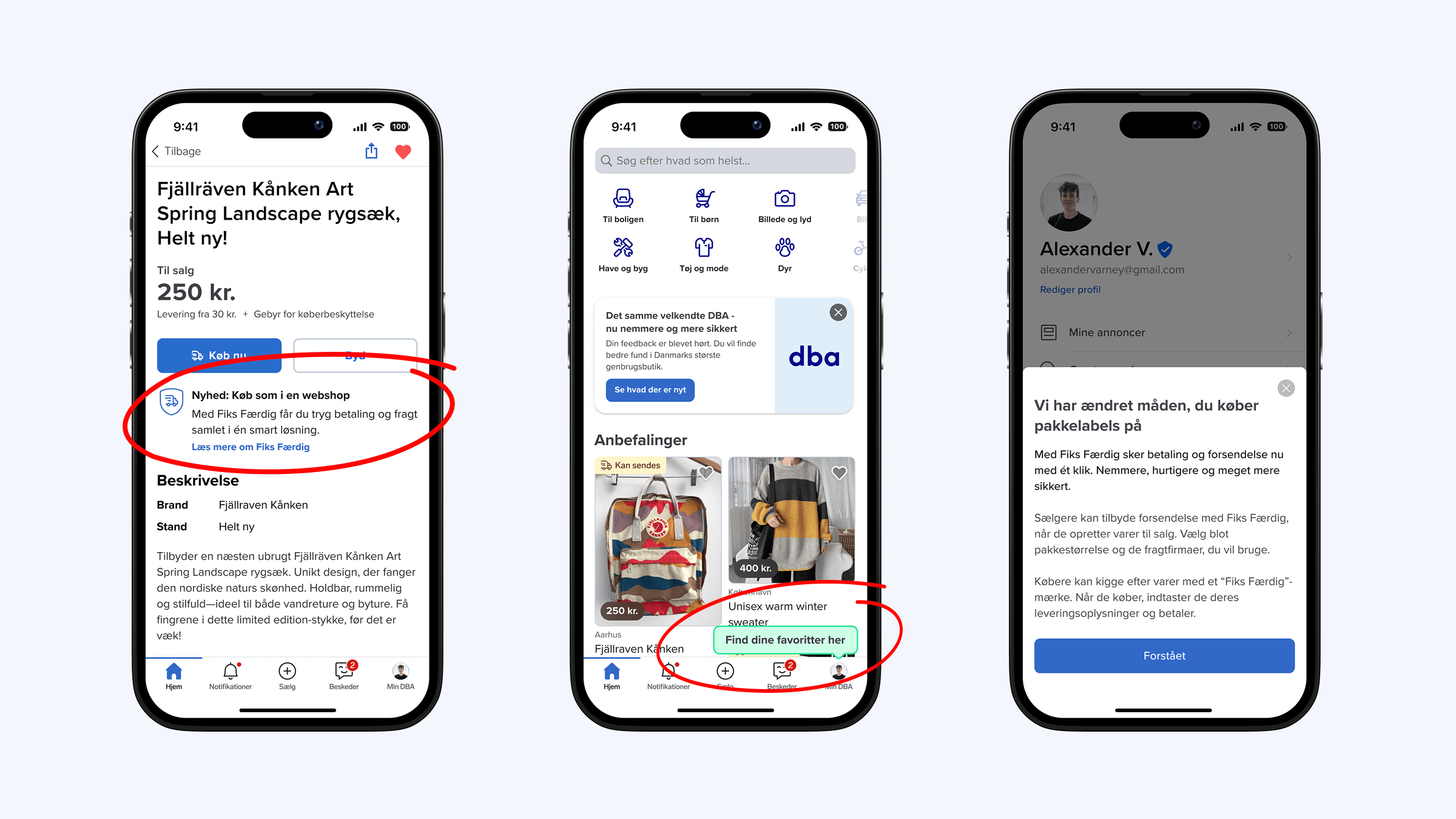 Three types of contextual user education shown at different points in the user journey
 I designed 20 proposals for improving user education within the user journey and shared them with the 10 different teams responsible for implementation. This process required a lot of documentation and coordination to make sure that implementation and all the logic for when to show the user education, worked well.
Most of all, it was important to keep the holistic user experience in mind, so that we wouldn't show more than one piece of user education at a time and to keep the amount of user education to a minimum to not overburden the user with information.
User onboarding
One of the most critical pieces of user education was the user onboarding flow that would be shown to users when they first opened the product after being migrated to the new modern platform.
The goal of the onboarding flow is first and foremost to make the users aware that they've landed in a new product and to highlight the key new features such as transactions, user reviews and shipping.
App store reviews and ChatGPT
From the prototype testing, I already had a rough idea of the most important features to highlight in the new onboarding flow, but to back those assumptions up with real data, I reached out to one of the app engineers and asked them to pull a list of all app store reviews from the past two years. I then uploaded them to ChatGPT and asked it to compile a list of the top 10 feature requests and top 10 complaints.
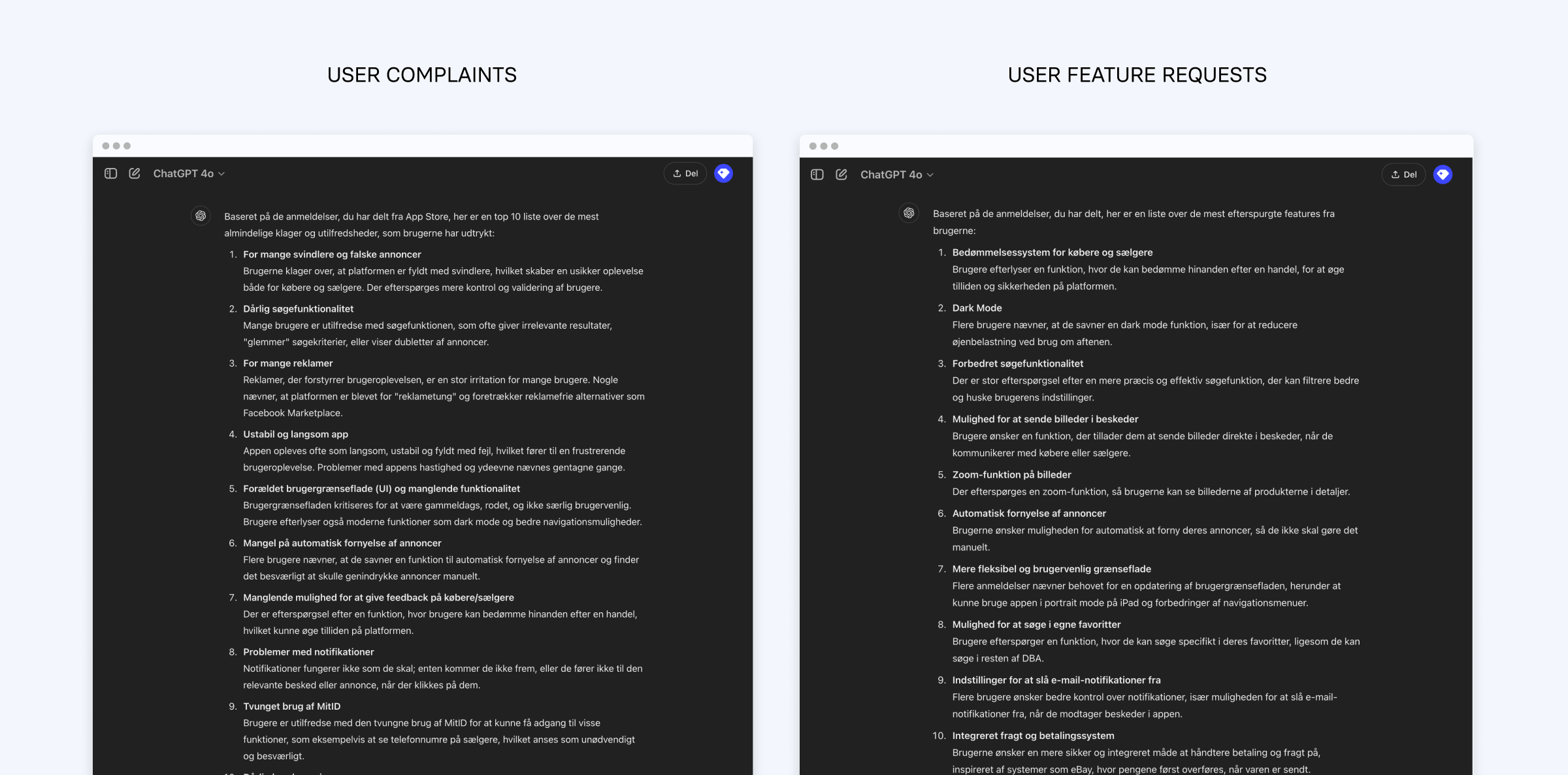 I used ChatGPT to summarize +200 app store reviews which informed what to highlight in the onboarding flow.
 With this data and the insights from user testing, I knew that the key things to highlight in the onboarding flow were user reviews, transactions and shipping.
I made a proposal of the copy and content and drew up some simple illustrations using simplified UI to highlight these new features. I versioned them for both web and apps and dark and light mode.
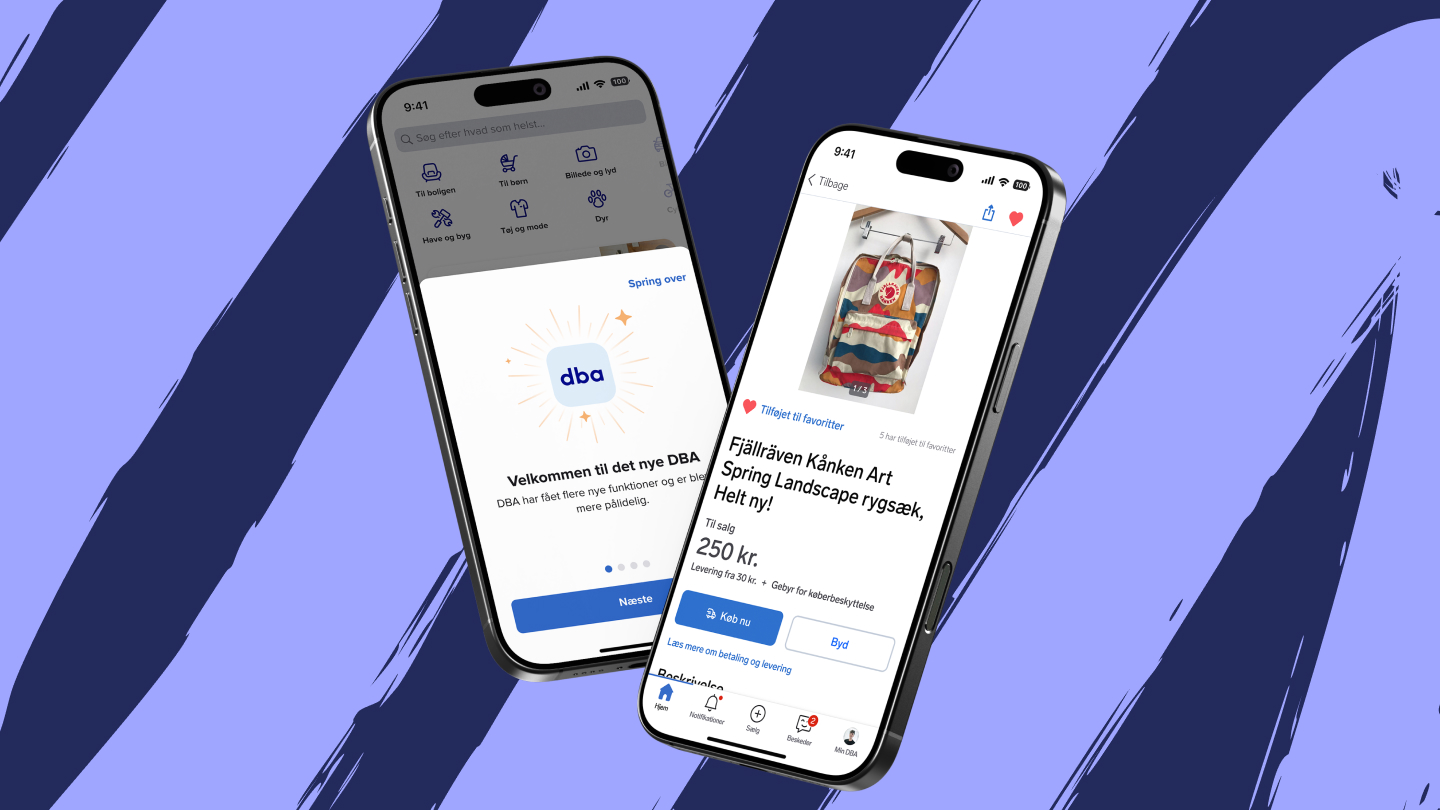
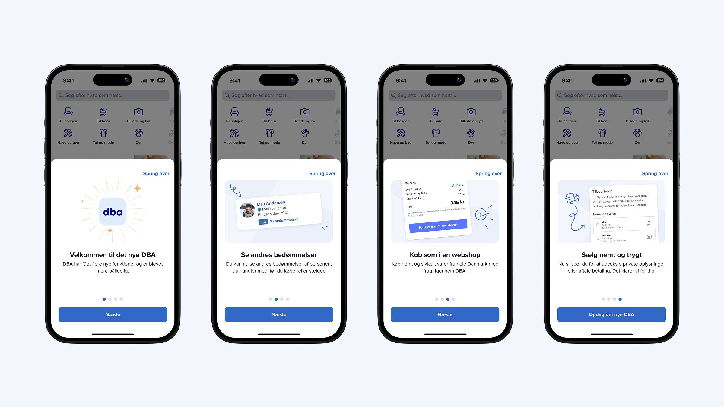 Light mode version of the final onboarding flow I designed
 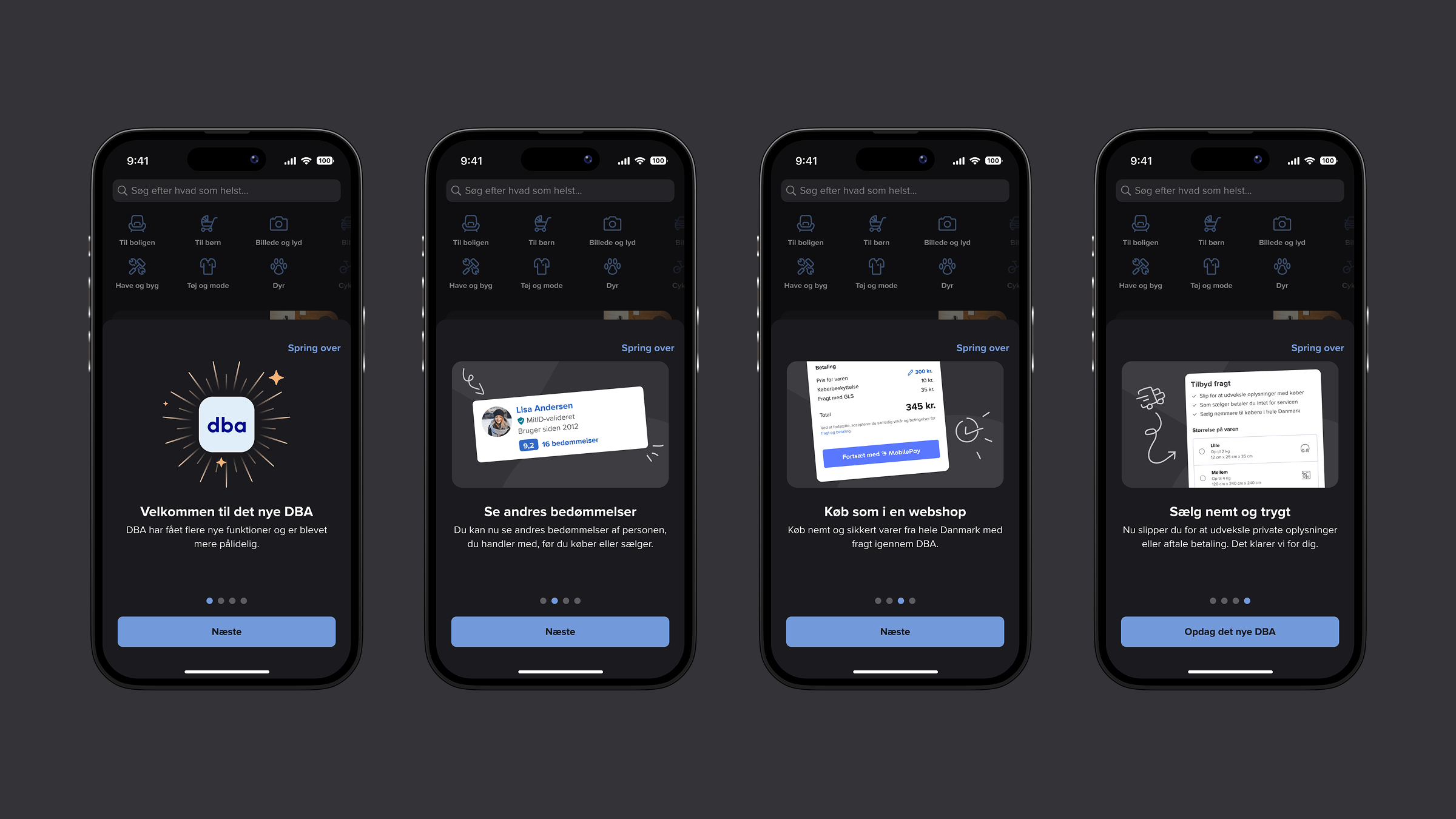 Dark mode version of the final onboarding flow I designed
 Wrapping up
Migrating a product with a large, loyal user base like DBA is never just a technical challenge - it’s a human one. Through user research, gap analysis, prototyping, user testing, and visual design, I helped shape a smoother transition by focusing on clear user education and thoughtful onboarding.
By identifying critical user pain points and designing UI elements for over 20 different touchpoints, I supported both the users and the many product teams involved in the rollout of the new DBA. The work helped reduce friction, improve user understanding, and ensure a better first impression of the new DBA experience.