Website rebrand for GoMore
Redesign and development of a large car sharing platform.
Overview
In February 2019, we launched a rebrand of GoMore, which included an updated logo, a new brand style guide, a softer color palette, and a redesigned website.
Our goal for the website was to preserve its existing functionality while focusing on a visual refresh rather than rethinking the way things worked. I led the design of the updated website, including implementation of the designs in CSS.
The rebrand was well-received by users and paved the way for a more cohesive and engaging experience, elevating GoMore's brand identity and ensuring its relevance for many years to come.
Company
GoMore
My contribution
Product Design
Frontend Development
Released
February 2019
Historical context
When GoMore launched in 2012, it started as a ridesharing platform where users could offer and book long-distance car rides. Over time, the platform evolved, expanding its offerings to include private car rentals, long-term car leasing, and opening in new markets across Europe.
As GoMore grew to over 3 million members, the company’s mission and values became more defined. However, the existing logo and visual identity no longer aligned with the brand’s direction. We had a clear vision, but the brand wasn’t effectively communicating it.
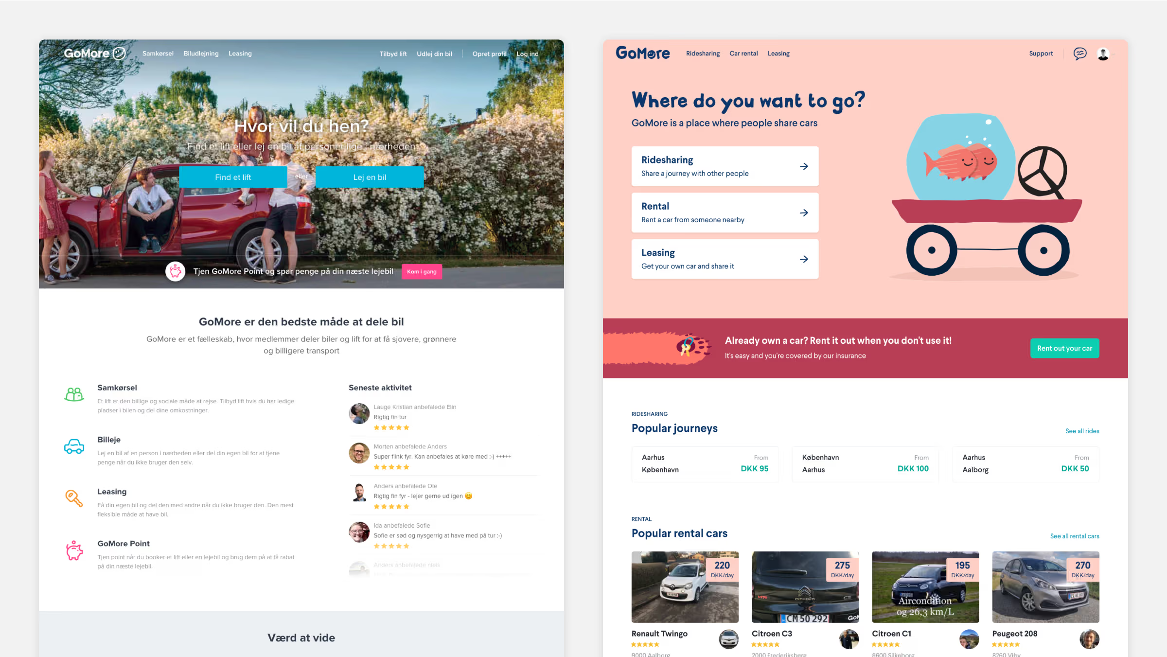 The old homepage on the left, the refreshed version on the right.
 In 2018, GoMore brought on a head of design to lead the development of a new brand identity. Together with two designers (including myself) and the leadership team, we set out to refresh the logo, color palette, typography, tone of voice, illustrations, and photography, with the aim of launching the new brand by early 2019.
Kicking off the rebrand
GoMore's new logo and visual style were based on a lighthearted, playful and more friendly aesthetic. After months of working on the rebranding process, we finally settled on the high-level direction and it was time to figure out how the new brand guidelines would work on the website, which I was tasked with.
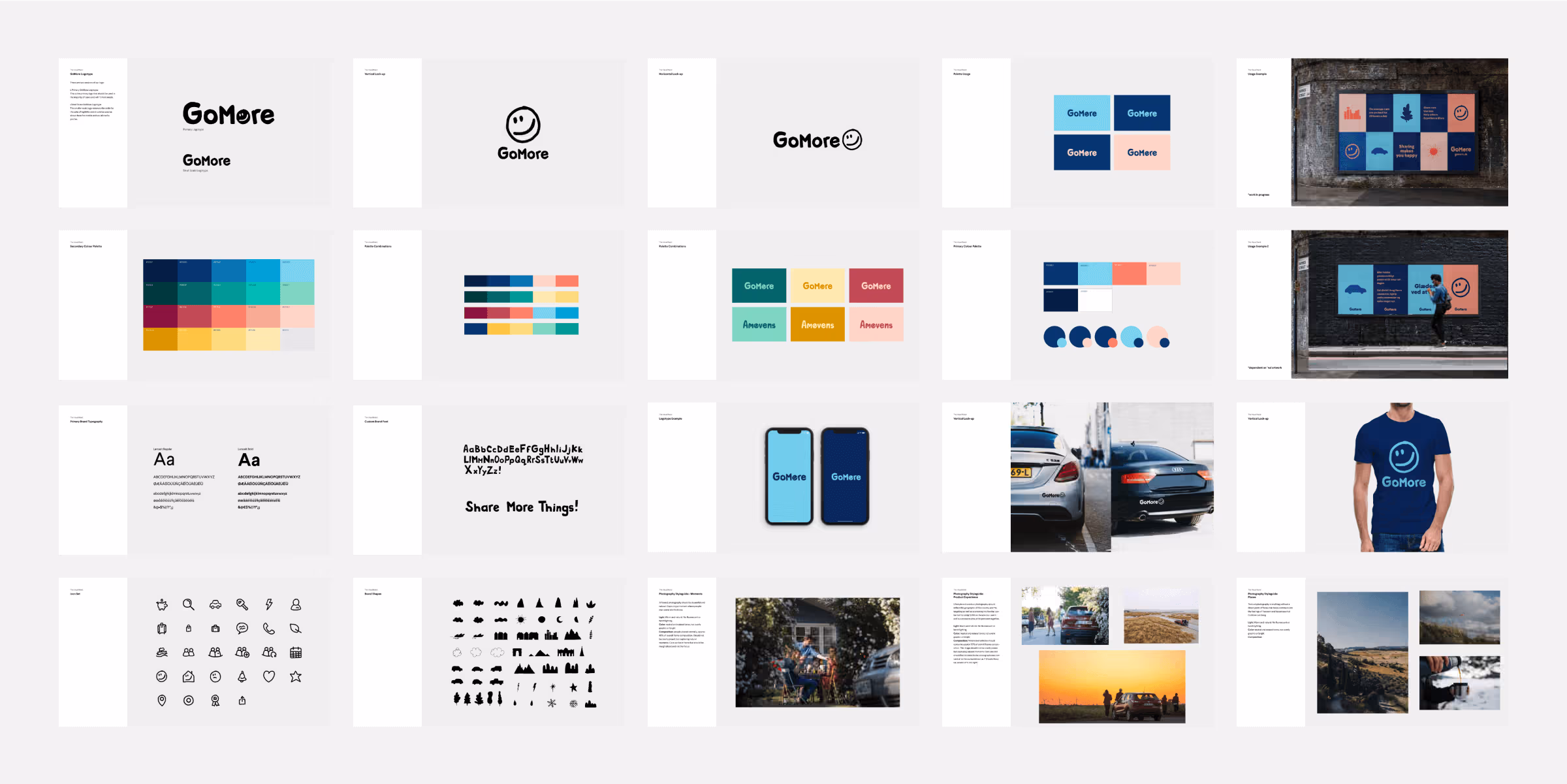 The updated GoMore brand guidelines.
 One of the key brand artifacts created by the head of design was a comprehensive brand book. This guide detailed fundamental elements like color, typography, photography, illustration, and layout, along with examples of how these guidelines could be applied. Every employee received a copy to ensure they understood the new brand and could apply the guidelines in their work.
While the brand book provided high-level guidelines, it included only few website mockups, leaving much to be defined about how the brand should be translated to the website.
I started exploring how to bring the brand to life on the website by focusing on our most important pages: the homepage, the search pages, the detail page, landing pages, and the navigation.
Applying the rebrand to the web
Starting with the homepage, I experimented with typography scales, button styles, page hierarchy, and more, while maintaining a layout and content similar to the existing site. When I needed input, I shared explorations in design critiques with the head of design and another product designer, and we'd discuss what was working and what wasn’t.
 Very early design explorations. I shared explorations like these in design crits, and we'd discuss what was working.
 Together, we identified the elements that were working and discussed what felt on or off-brand, along with the reasons why. We also held regular meetings with the leadership team to present our explorations and gather their feedback. Through these iterations and critiques, we began to solidify how the brand should be expressed on the website.
Typography
In close collaboration with the head of design, I selected Larsseit as our new primary brand typeface. It’s a modern yet playful font with excellent readability and distinctive quirks in its letterforms, making it a perfect fit for the new brand.
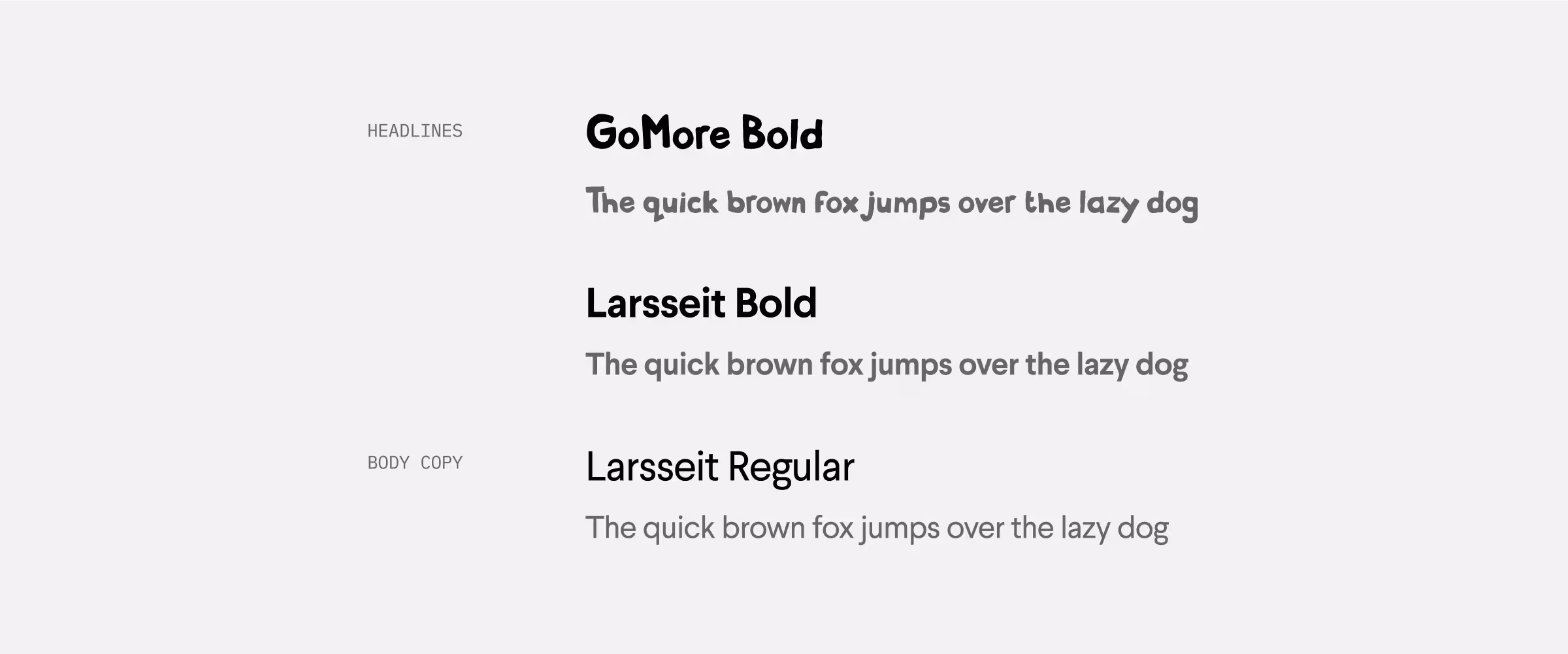 Typography.
 Additionally, the head of design crafted a custom font based on the logo, intended for use sparingly in headlines and other areas where a touch of extra branding was needed.
Icons
Previously, GoMore had a set of custom handdrawn icons made by e-Types to represent each of the different product offerings; ridesharing, rental and leasing. As part of the rebranding process, we created a new icon set based on the work done by e-Types, redrawing and tightening up the existing icons while also expanding the collection with many new additions.
 Brand icons and functional icons adapted for web.
 These icons were rich in detail due to their hand-drawn nature. However, for the web, I designed a more functional set of icons tailored for smaller sizes - 16px and 24px - and for functional areas of the products where navigation, findability, and conversion were crucial. These icons needed to be easily recognizable and optimized for quick scanning, such as arrows, close icons, and navigation elements.
Use of color
Since color played a vital role in the brand, we spent considerable time discussing how to apply it effectively on the web. We decided to keep the task-oriented parts of the site, such as navigation, search pages and product detail pages, mostly in black and white to maintain focus.
In contrast, we used bold splashes of color with illustrations in areas like the footer, page headers, and landing pages. My goal was to ensure that color remained special and impactful without overwhelming or distracting the user.
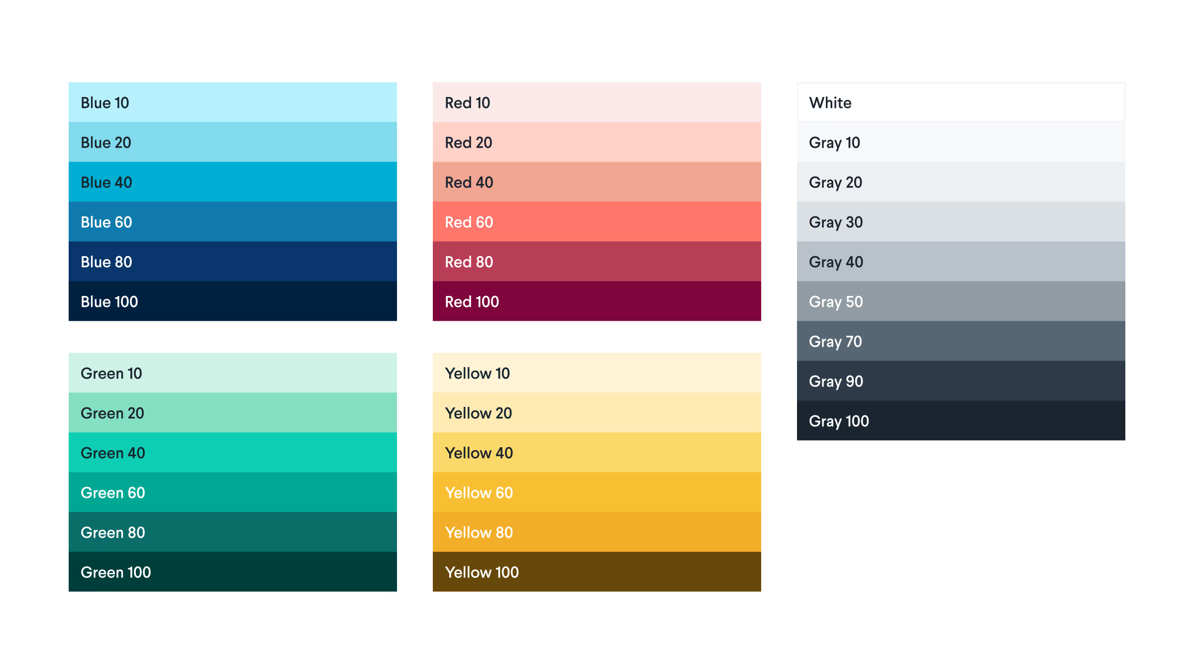 Color palette adapted for web and UI.
 Color palette
Our new brand palette had 20 colors and specific color combinations we knew worked well together. We also needed some colors specifically for the web that were both more subtle and more accessible. We expanded the color palette with some additional, accessible colors specifically to be used for UI work.
 We kept the majority of the website black and white.
 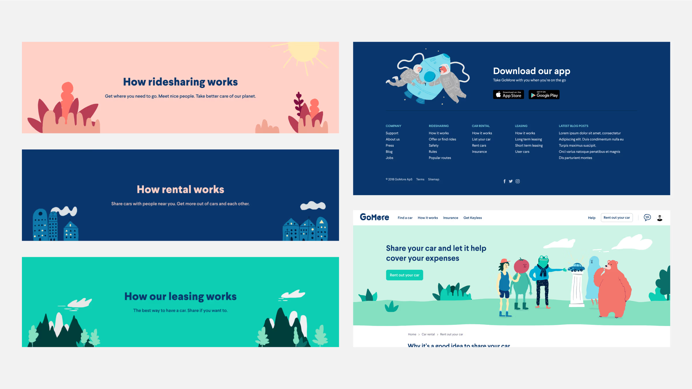 In other parts of the website, we went all-in on colors.
 Animation
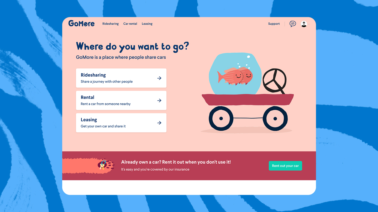
I also explored ways to incorporate animation into the website, aiming to create a memorable first impression on the homepage. When we started experimenting with an illustration of a fishbowl on a cartwheel, it quickly became clear that it needed to move.
While the head of design crafted the animation, I focused on finding the best way to embed it on the site, prioritizing load times due to the animation's complexity and large file size.
I explored various techniques, including using the Lottie animation framework, CSS sprites, and others. Ultimately, we opted to export the animated fishbowl as a GIF, as this provided the smallest file size and fastest loading times. For mobile, we decided to use a static version of the illustration to maintain performance.
Throughout the website, we found opportunities to add subtle animation delights. For instance, on the “How it works” pages, we used a bit of CSS with the SVGs to bring the buildings to life, making the lights in the windows turn on and off.
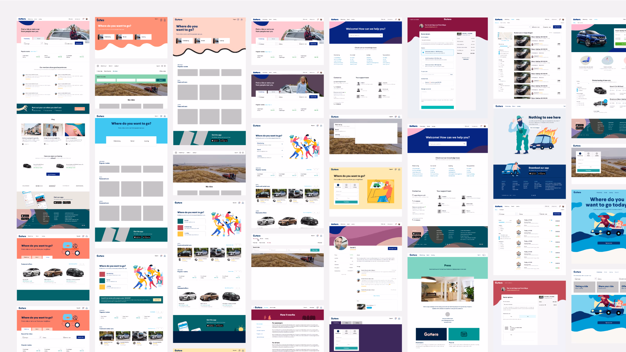
The final design
The final design brought together all the elements of the rebrand - color, typography, illustration, and animation - into a cohesive and engaging user experience. The updated website not only reflected GoMore’s new brand identity but also improved usability and visual appeal across every page.
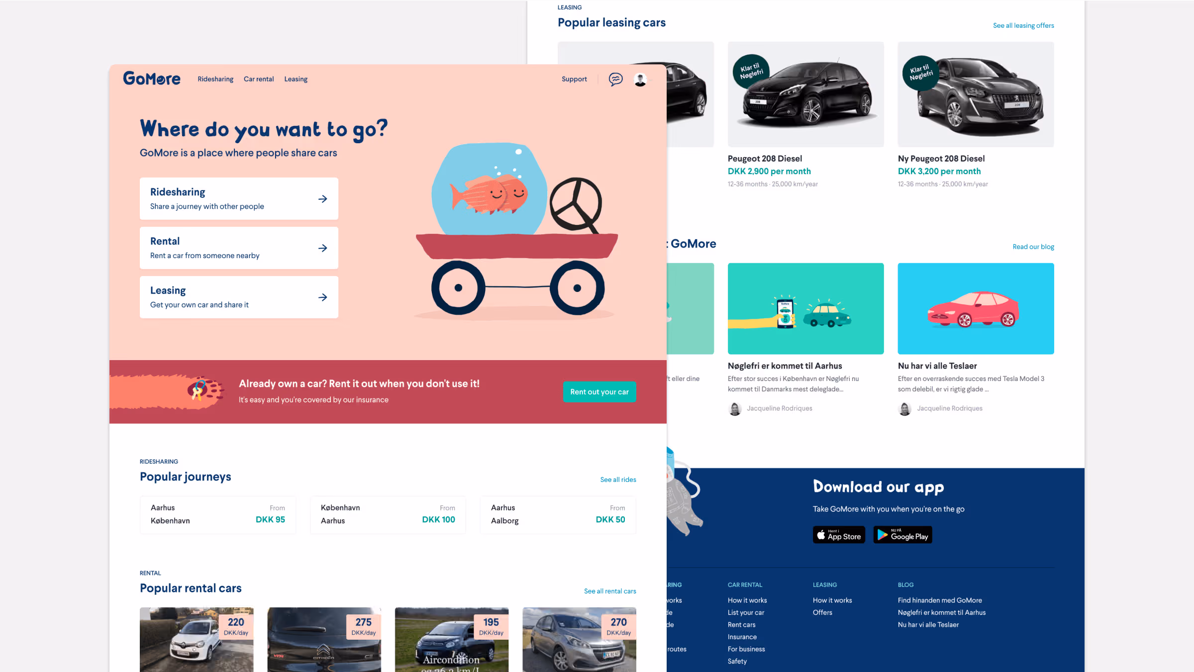 The updated homepage that Encourages discoverability.
  The navigation could adapt to what product the user was interested in.
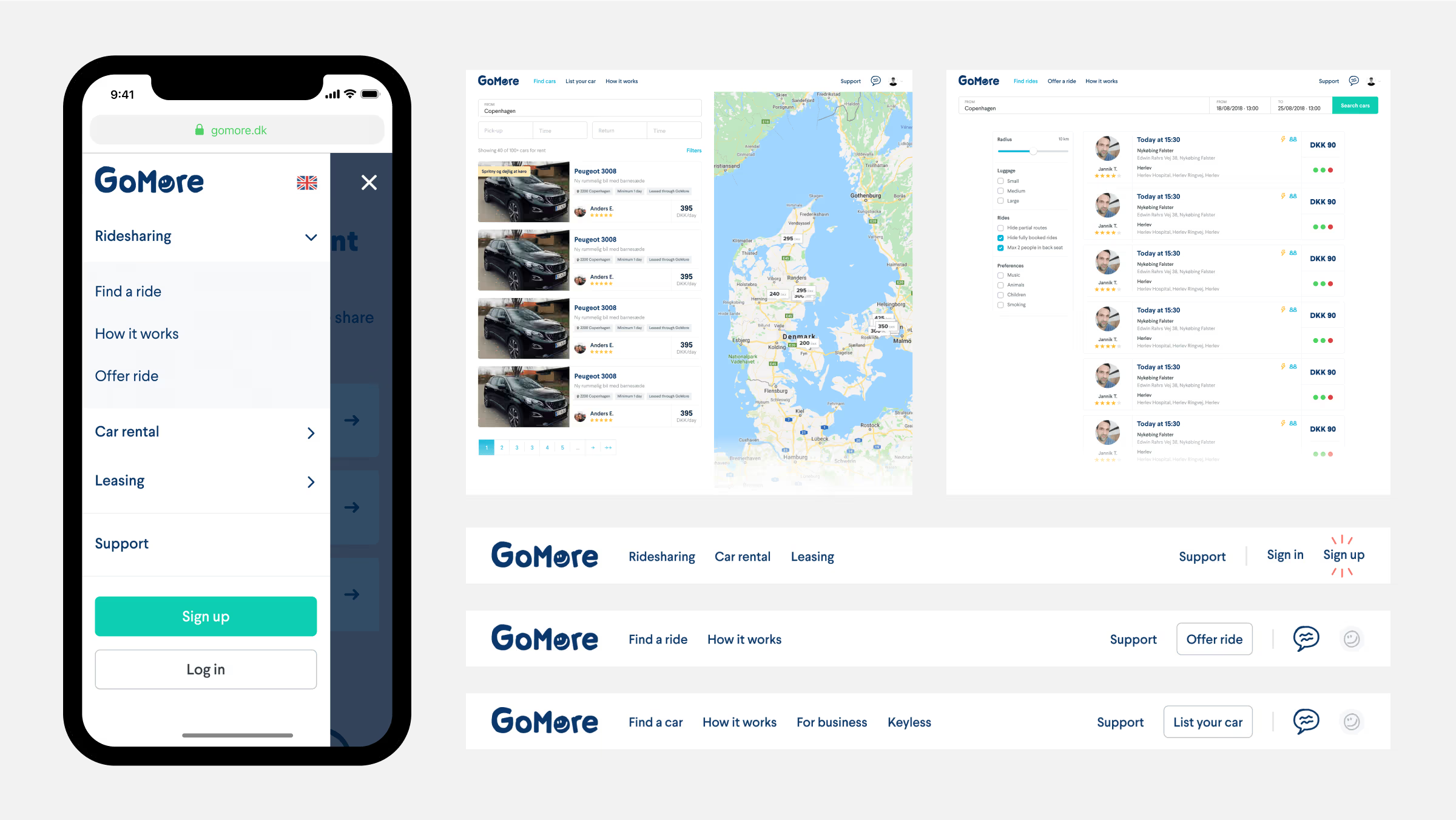
 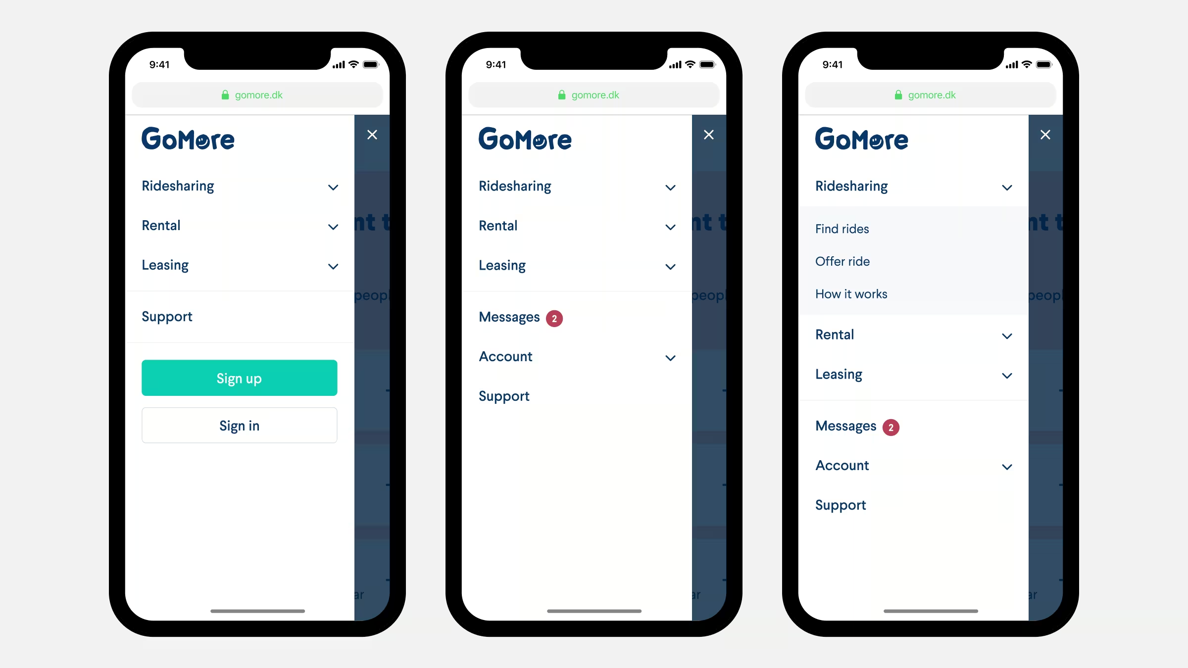 Mobile navigation: logged out state, default state and ridesharing state shown.
 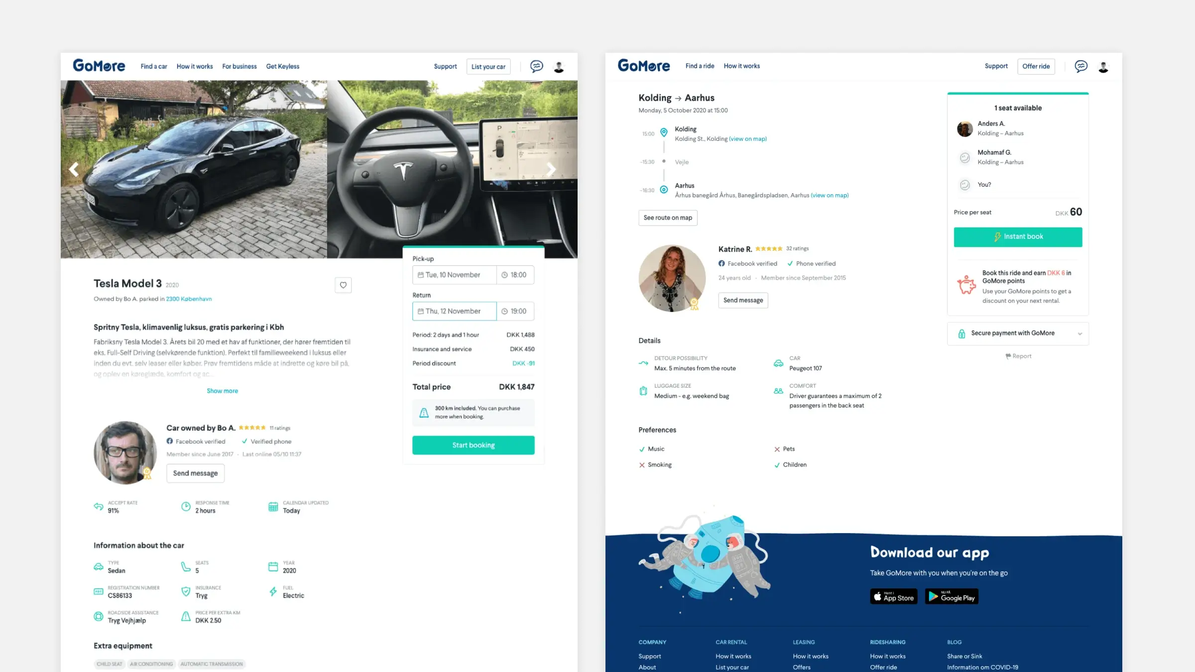 Product detail pages. Rental on the left and ridesharing on the right.
 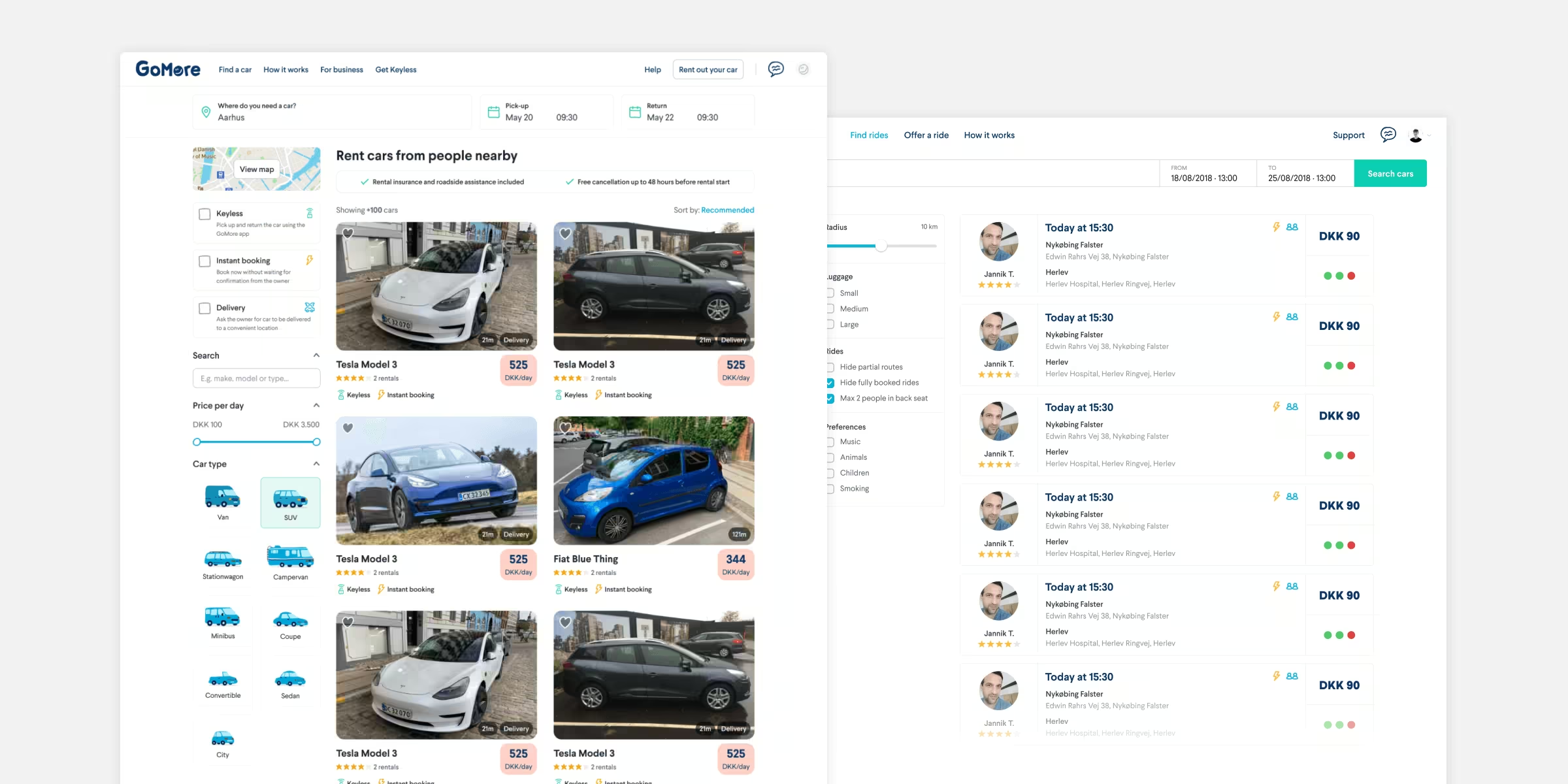 The search pages. Rental on the left and ridesharing on the right.
 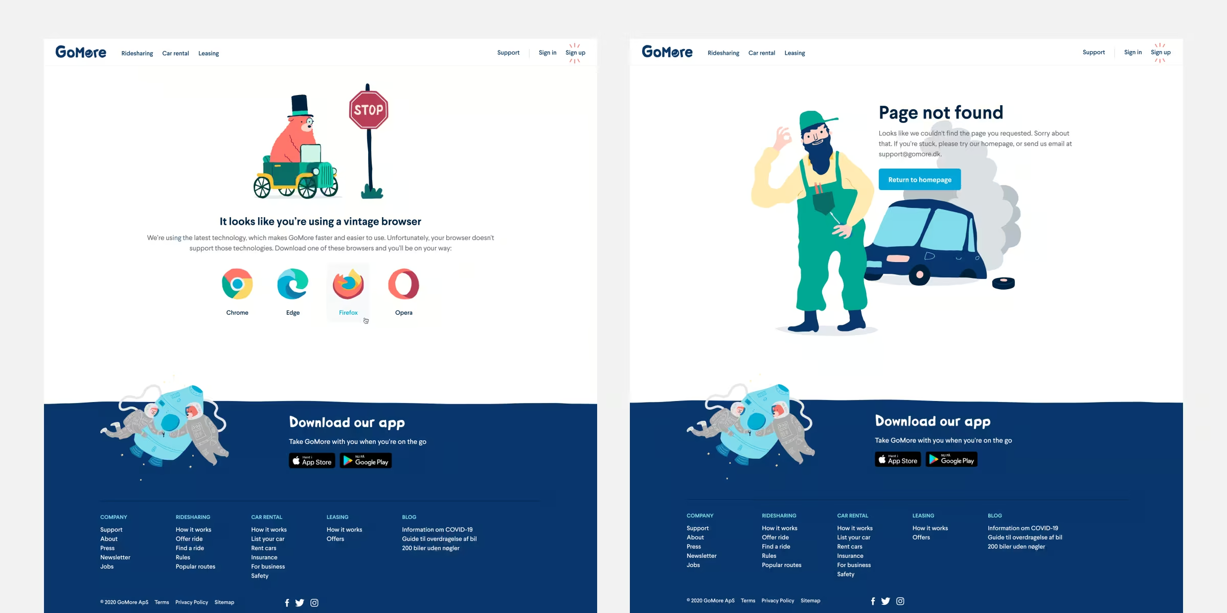 When possible, We took the liberty to add a splash of humour to the website.
 Building the website
GoMore was unique in that it didn’t have dedicated frontend engineers. Fortunately, the backend engineers had an interest in frontend work, and the designers were comfortable with markup and styling. Together with one of the engineers, I took on the daunting task of updating CSS variables for color and typography, which affected every part of the website. Luckily, we had recently refactored much of our legacy Bootstrap-based CSS to use utility classes similar to Tailwind CSS, making the process significantly smoother.
We managed to update all global CSS to the new design in a few days, pausing regular feature work to avoid a tangle of merge conflicts. With these global updates in place, we could more easily focus on updating specific pages behind feature flags.
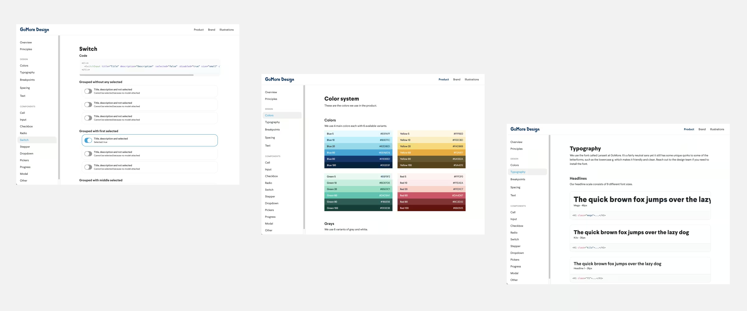 Web styleguide and mini component library.
 Launch and reception
In early February 2019, we launched the brand refresh. The rebrand was very well-received, and our users responded positively. One thing that stood out was how much better we were at telling our story; we received a lot of feedback from people expressing their love for our mission.