Redesigning a referral program
Redesigning a referral program to be more cost-effective, saving +3.5M DKK per year.
Overview
We spent 10 weeks exploring how we could increase the number of customers sharing their referral code and make the referral program more cost-effective. We came up with four different initiatives to help achieve our goals.
We significantly improved the visibility of the referral program and made customers share their referral code earlier. We also made the referral program more cost-effective, saving the business more than 3.5M DKK per year.
Company
Undo Forsikringsagentur
My contribution
Product Design
Product Discovery
User Research
Released
March 2023
Context
Referrals have historically been a large part of Undo’s growth strategy, accounting for up to 30% of growth at times. It has been driven mainly by a very generous referral reward; two months of free insurance for both the referrer and referee.
One of the first projects I worked on after joining Undo was adjusting the referral reward to one month of free insurance for both parties in an attempt reduce the customer acquisition cost significantly and create a more sustainable growth engine.
Defining the problem
A number of different variables had negatively impacted referral growth. I had recently helped lower the referral reward and we had changed the UI of how we promote the referral program as part of a different feature.
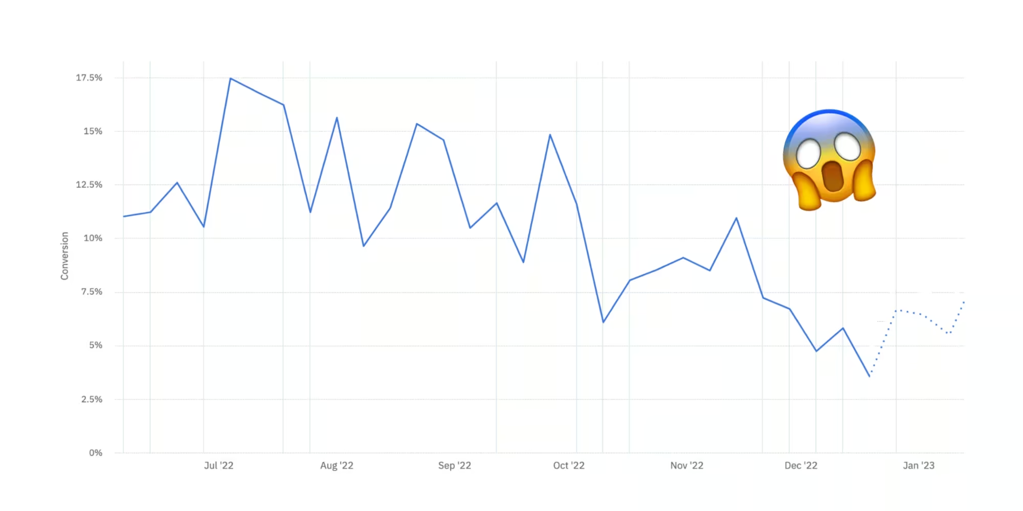 Graph showing how referral shares have gone down over time.
 Because of how important the referral program was for growth, it became high priority to explore how we might increase the number of people sharing their referral code.
In the product trio - tech lead, product manager and designer - we defined an objective and key results for the cycle in collaboration with leadership.
User research
To make a meaningful impact, it was crucial to ensure that we had a solid understanding of the context in which we were addressing the problem.
Together with the UX Researcher, I started to collect insights from the support team who talk to customers every day.
We also spent a day calling customers that had recently shared their referral code to understand their motivation for doing so. We also called customers that had not yet shared their referral code, to understand what was holding them back from sharing.
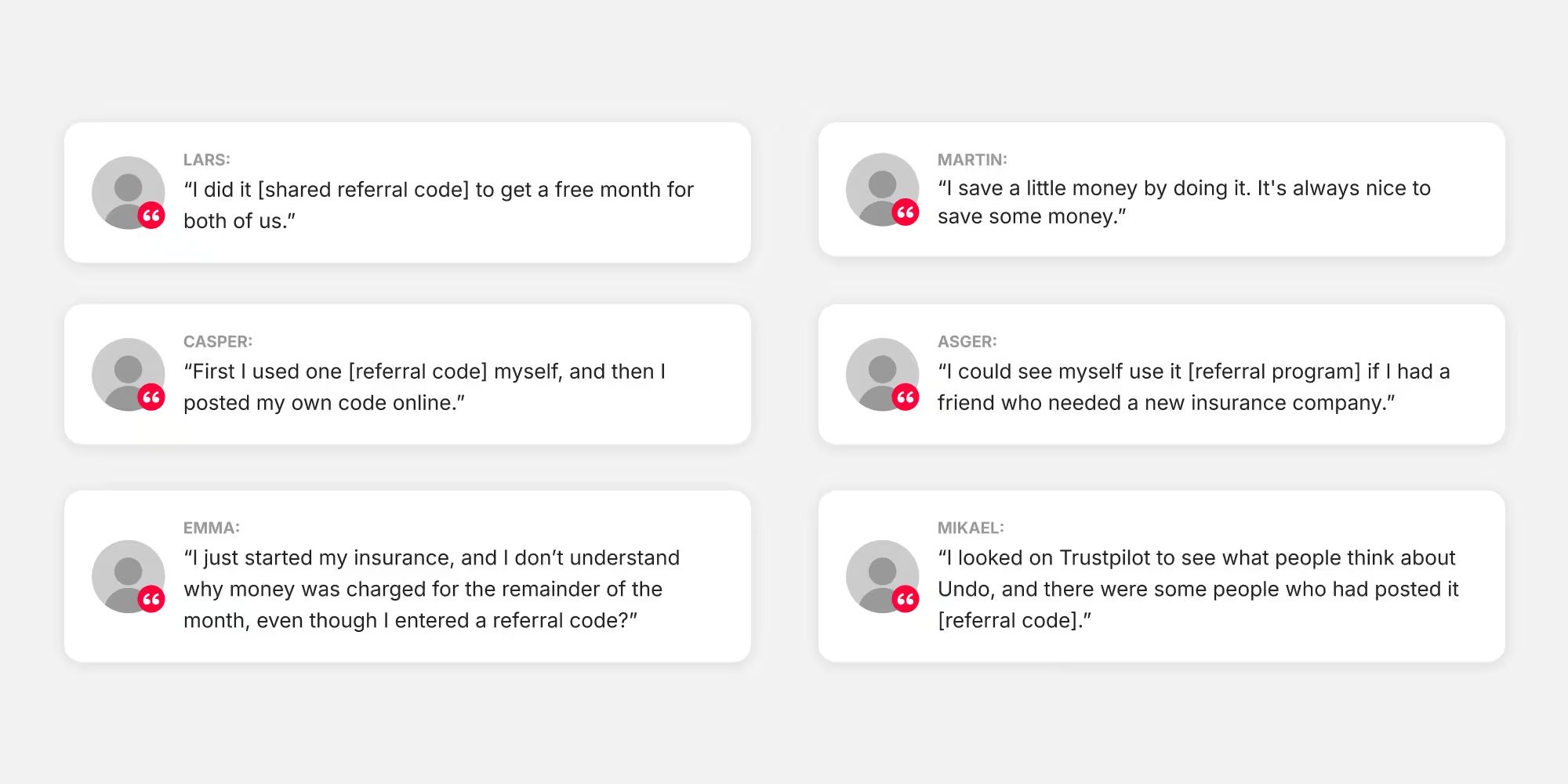 Various statements from customers we interviewed
 Saving money... yes, of course
It was hardly a surprise to learn that the primary motivation for sharing their referral code was to save money for 80% of the customers.
However, an interesting observation was that the actual claiming of these codes depended significantly on whether the customer had friends or family actively seeking new insurance – a factor largely beyond our control.
This implied that while we may have the ability to influence the number of customers sharing their referral codes and how early they share, controlling whether the referral codes are claimed is much more challenging.
Unintended consequences
We uncovered more insights during our user research. For example, we discovered that a considerable number of customers had proactively searched online and found a referral code.
This discovery indicated that as a business, we were inadvertently incurring a double acquisition cost for these customers, contrary to the intention of the referral program.
Many customers also expressed confusion about when their discount was applied and how to use the discount.
Competitive analysis
As part of the research phase, I conducted competitor research and studied best practises for high-performing referral programs.
 Mapping of competitors and referral best practises.
 Ideation
We have a ritual known as a scramble. It's an extended cycle kick-off where the entire team gathers in-office for 1-2 days to establish a shared understanding of the strategic context and brainstorm on initiatives.
Together with the UX Researcher and Product Manager, we presented our user research findings, competitor research, best practices, and data on referral usage to the team.
We then conducted a series of group exercises with the goal of generating hypotheses that we could then use as a foundation for generating ideas.
Each idea was summarized in a mini-pitch, with estimates for effort, risks, and impact. We organized them using an impact/effort scoring system, making it easy to identify which initiatives would likely drive the most impact.
 Scramble material and a prioritized list of initiatives.
 Initiatives
From the numerous initiatives we generated, we selected 4 to pursue, aligning with our key results and the appetite we had set for 10 weeks.
Initiative 1: Improve visibility of the referral program
We believe that we can improve referral shares by making changes to the “Your insurance” screen so referral is promoted better and made more visible.
Initiative 2: Increase clarity of the referral program
We believe that improving the clarity of the screen and explaining more about how referral works will positively influence referral shares. Furthermore, by integrating design psychology nudges such as social proof, positive reinforcement, and anchoring, we believe that we can motivate customers to share their referral code.
Initiative 3: Referral campaign tool
We believe that by offering time-limited referral campaigns, we can utilize time-limited scarcity and thereby influence more customers to share their referral code.
Initiative 4: Decrease visibility of the coupon field when purchasing
We believe that many new customers search online for a coupon code when they are presented with the option of adding a coupon code in the purchase flow. We believe that making the coupon field less prominent in the purchase flow, will lower the referral program costs.
Evaluating the current design
We had a hypothesis that many customers didn't notice the referral program, so before starting any design work, I needed to better understand user behavior.
To do this, I set up a usability test with the current design using Maze to understand how easy it was to find the referral program in the app.
It turned out that many customers simply did not see the referral program because of a cognitive bias called banner blindness. The UI to promote the referral program looked too much like an ad, meaning that customers subconsciously ignored it.
This was validated by the Maze test, where a heatmap clearly showed that customers expected to find it in the Profile tab bar. On average it took people 13.5 seconds to find it, even though it lived almost at the top of the screen.
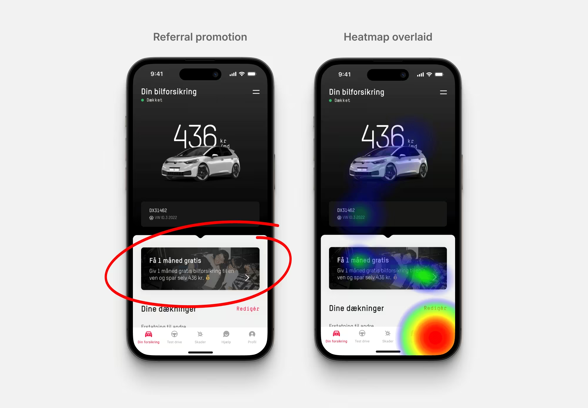 A heatmap showing how banner blindness influences the visibility of the referral promotion.
 Wireframes
Based on these learnings, I started drawing up different ideas for how to make the referral program more visible based on the input from the team at the scramble.
The goal was primarily to create a shared understanding of the different initiatives in the team, so I opted for creating low-fidelity wireframes to be able to quickly present, discuss and align on our options.
 Wireframes
 Initiatives
In the team, we decided to pursue the following four initiatives.
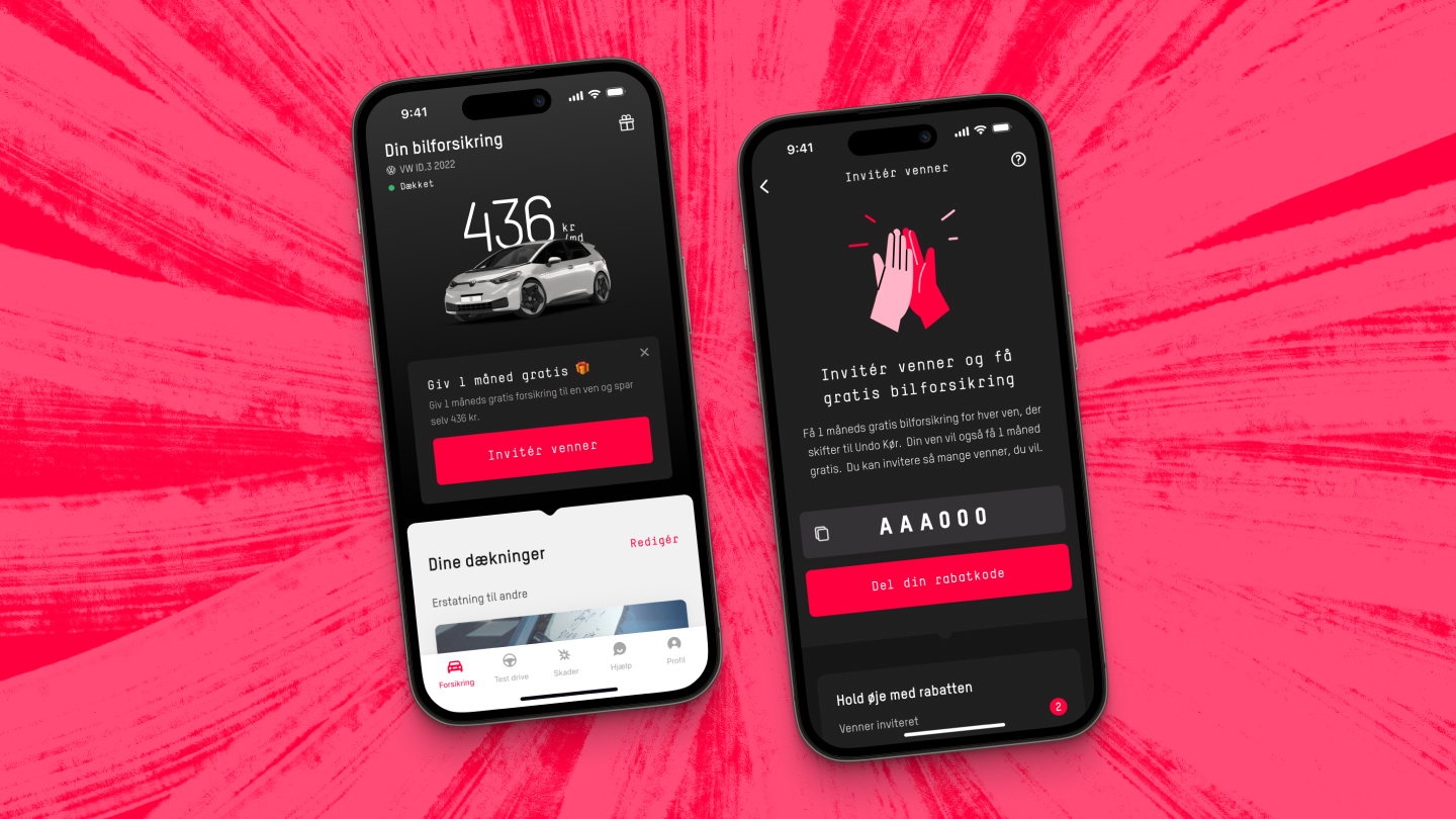
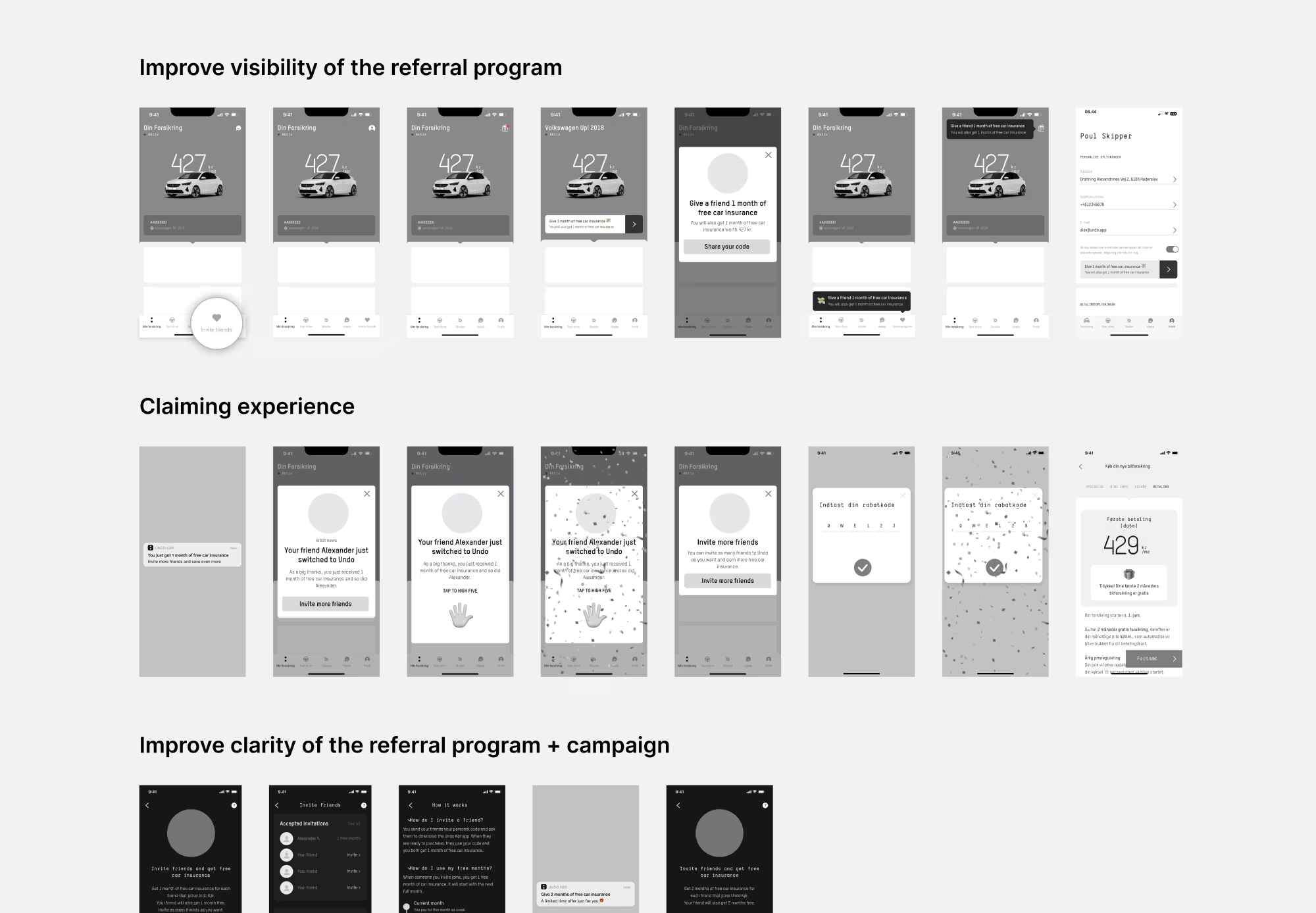
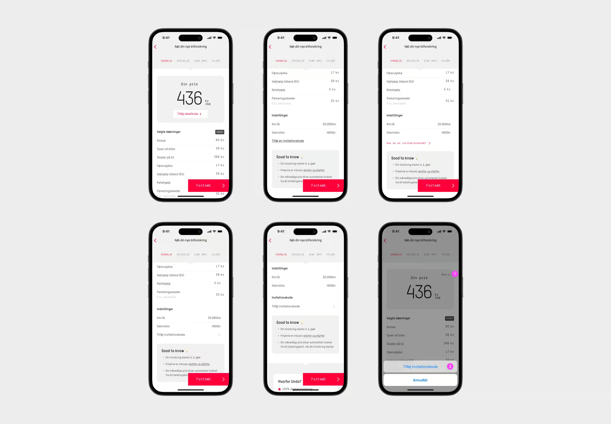
Improve visibility of the referral program
In close collaboration with the team, I designed a more clear call-to-action to promote the referral program. It looked less like a banner and was dismissible, so that customers that had already seen the banner could dismiss it and stay in control of the app experience.
I also added an icon in the top right corner of the screen that now served as the central place to find the referral program - for example if customers dismissed the banner.
Because I was changing the placement of where to find the referral program, customers would have to “unlearn” where to find the referral program. I designed a simple UI animation for this purpose when customers closed the banner to encourage discovery and for memorizing the new placement.
 The redesigned referral promotion, before and after.
 Increase clarity of the referral program
I worked with different psychological design principles to redesign the main referral screen.
A new status component show how many people you’ve already invited and how many free months of insurance you have available. It also utilizes positive reinforcement, by showing customers how much money they’ve already saved, encouraging them to share their referral code even more.
We show how much other customers are saving to utilize social proof and creating some FOMO. By mentioning how much other customers are saving, we utilize anchoring bias, to set expectations about how much money they could save by inviting friends.
In our user research we found that some customers were confused about the process and how they spend the free months they earn. We worked with increasing the transparency and clarity by creating a component to show the referral process and creating a FAQ-like screen with more information for those that need it.
 The redesigned referral details screen and FAQ.
 Referral campaign tool
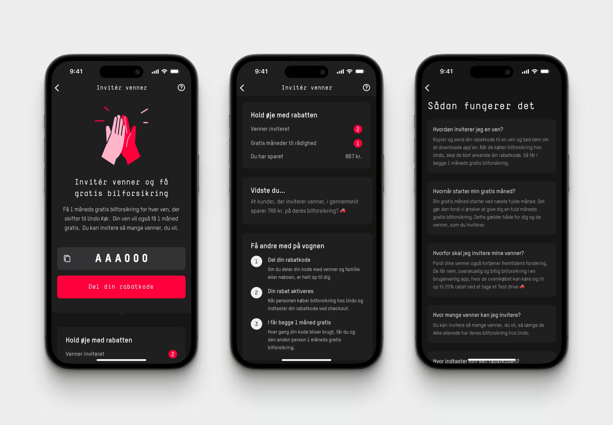
While we were focusing mainly on activating new customers, we could see from data that once a customers had been with us for more than 30 days, only 3% of them were likely to share their referral code.
It makes sense since we’re inherently a low-engagement app. Once you’ve bought your insurance, you’re covered and there’s no reason to open the app again until you need to file a claim or edit your insurance.
But this also presented us with an important opportunity to re-activate the existing customer base. One way to do that is by creating a campaign tool where customers can earn double the months of free insurance for a limited time. This utilizes time-limited scarcity to encourage customers to share their referral code.
 The referral campaign tool, doubling the reward for a limited period.
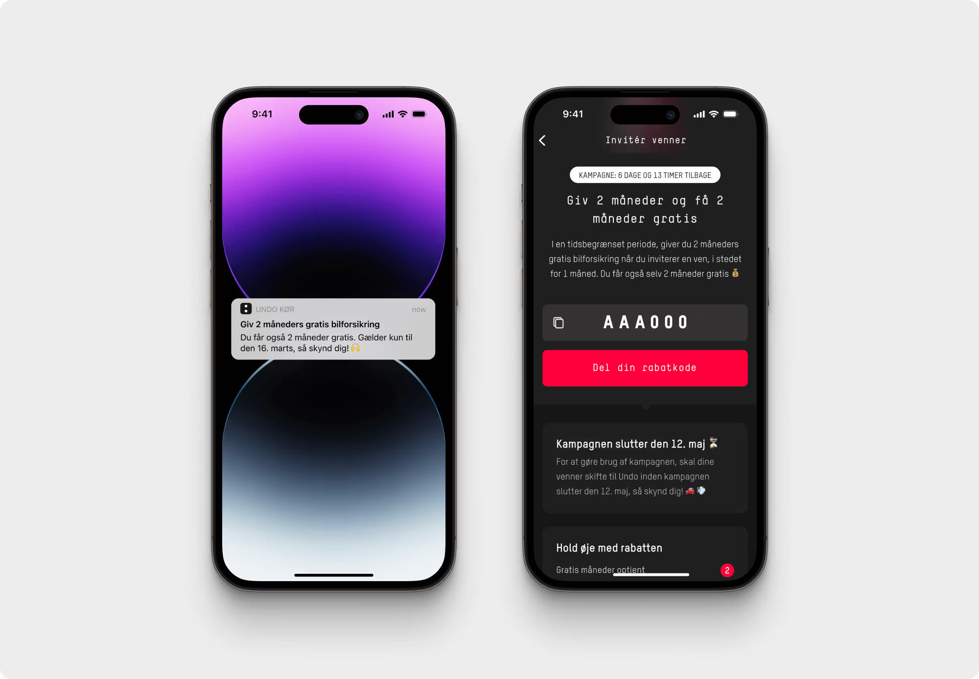
 Decrease visibility of the coupon field
In our user research, we found that a high percentage of new customers searched online for a coupon code solely because they were presented with the option of adding a coupon code in the purchase flow.
Knowing that other customers might get 1 month of free insurance makes them feel as though they are missing out and interrupting them from completing their purchase.
This concept is closely related to a concept called loss aversion. As humans, we hate losing or missing out on what we could have had. A potential loss hurts more than an equal gain feels good.
This initiative didn’t directly relate to one of our key results for the cycle, but because it was hurting our conversion rate and incurring double customer acquisition costs, we decided to include it in this cycle.
 The purchase flow, before and after.
 I designed 6 different variations of the purchase screen to make the coupon field more subtle, while still not making it impossible to find.
My goal was to make the coupon field less prominent without hiding it, ensuring that referred customers could easily locate it when actively searching for it.
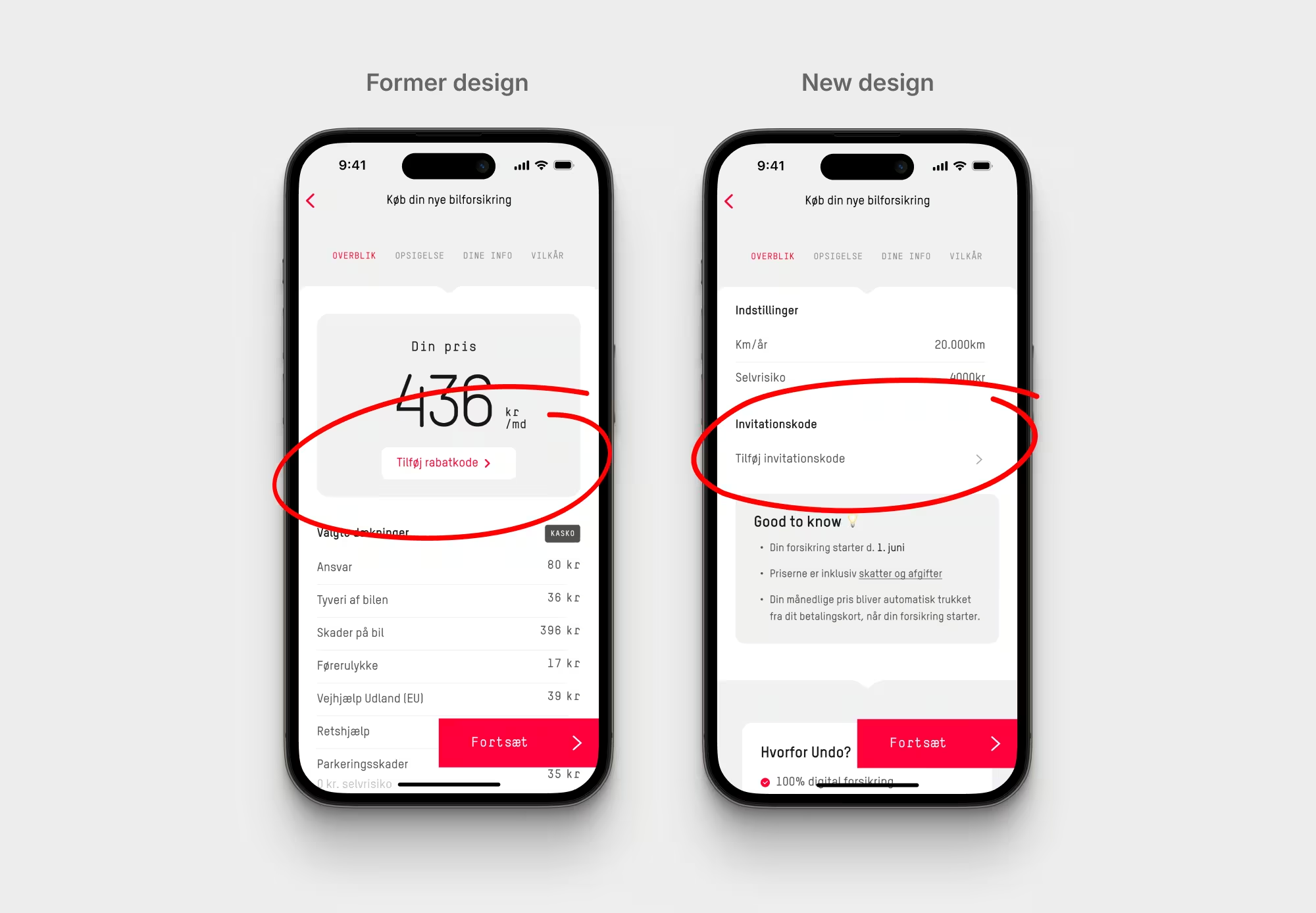
Of the 6 different variations I designed, we A/B tested 3 variations.
 Some of the design variations of the purchase screen.
 The results were staggering. Not only did this test lower referral costs by 21%, it also improved conversion rate by 10%, saving the company over 3.5M DKK yearly.
Outcomes
Improving the visibility of the referral program boosted the percentage of customers noticing the referral screen from 40% to 62%, marking a 55% increase. It also encouraged customers to share their referral codes earlier, which is an important factor for referral growth.
Yet, over an extended period (+120 days), the data indicates that these changes had only a minor impact on increasing sharing. This implies that it's tougher than anticipated to motivate customers to share primarily through interface design.
Our user research revealed that sharing is significantly influenced by whether customers have friends or family looking for new insurance. Unfortunately, this is a factor largely beyond our control.
We successfully managed to optimize the referral program for cost-efficiency. This initiative saves the business over 3.5 million DKK per year, and the savings are expected to grow as the business grows.
Learnings
A successful referral program depends largely on having a good product and offering a compelling reward. Improving these factors will drive the most significant impact. For products that don’t yet have strong product-market fit, a referral program will only have limited impact.
Ensuring that the referral program is transparent and clearly communicates its offerings is crucial. Referrers risk their social capital by endorsing the product, and any uncertainty may deter customers from sharing.
The most significant impact sometimes come from the smallest initiatives, as demonstrated in this cycle.
More cycle iterations are needed to improve referral sharing further.